We’re still finding more cool things in our archives, so here’s a new installment of our Deep Dive feature. Hope you like it!
How did you come to do all the North Bay Nugget Christmas cards?
The North Bay Nugget is North Bay’s community newspaper. After moving to the tiny community of Corbeil (just outside of town), I soon got to know the publisher, graphic artist and editors. One year, I was asked if I would create a unique Christmas card for the Nugget to send out to clients and friends. I didn’t want them to pay me, so I did it as a gift. The next year, they asked me to make this an annual commitment and I agreed—in exchange for them printing my personal Christmas cards on their presses. For many years, I produced an original Christmas greeting card for the Nugget and the newspaper printed mine. It was a great exchange, and resulted in some fun and funny images. The card you see above has a lot of different faces—all of which were made up…just random cartoon faces. Even though this was the case, some folks on the newspaper staff insisted I had drawn a caricature of them.
Do you have any reminiscences about Peru?
I had gone to Peru to work with the Medical Missions. As a volunteer, I said I knew enough Spanish to be helpful. When my identification card arrived, it said “translator” on the top, and so I was tossed into learning the language fast and furious, and on the job. Immersion like this gets you close to fluency mighty fast!
On this trip, we were housed in a Christian compound a few miles out of Cuzco. Our job was to work in outreach clinics, providing medical and dental help to people who would otherwise go without. My time was spent between the doctors and dentists, explaining procedures to patients so that they would be well informed, unafraid and cooperative.
The Peruvians are beautiful, funny, helpful and articulate people who welcomed us all with enthusiasm. The best way to really experience a country is to work there—even for a week or two; nothing puts you into the picture like working alongside the locals. This photo was taken in Arequipa en route to Aguas Calientes and Machu Picchu. We were given the weekend to sightsee. Not wanting to shop, I was waiting for some of the other volunteers. This woman, her children, and two new baby goats were standing nearby hoping I would pay them to have a photo taken. Since there was little going on, and business was slow, I had my picture taken and this is it. I have been to Peru several times. I have friends there and will go again. It’s a country that beckons my soul.
Started a couple months ago, our Deep Dive feature has proven to be a hit. Here are a few more things we found in our archive, with some notes from Lynn on what they’re all about!
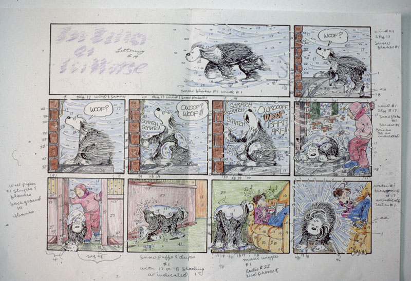
When the Sunday pages were coloured by “American Colour” in Buffalo NY, We had to send their colourists a photocopy of the original art, hand-coloured and numbered according to the colour chart they supplied us. This was quite a process, but at the time, we were excited to be able to use over 100 colours (up from 64, which was up from about 10). Sending the original art to Kansas City, and the colour rough to American Colour, meant that the 8 week lead time was essential if we were going to see the strip in the newspaper on the designated date. Now, everything can be done in an instant…but the lead time for the Sunday page, according to our contract, is still 8 weeks! Go figure!
When I draw and colour a personal greeting card by hand, I always put this little bird on the back. I confess, I don’t think this is an original idea. I think I swiped it from another cartoonist, but I have no idea who or when. Maybe by default, or by “grandfathering,” I can now call it my own!
Over Lynn’s long career, she’s accumulated lots of photos and artwork (see our first Deep Dive feature for some more background info). We thought it was time to pull some interesting items out of our archives, show them to Lynn, and ask her to tell us the stories behind them.
Can you tell us a bit about how it felt to win the Reuben?
I was overjoyed by my nomination, but I was expecting not to win. Jim Davis was also nominated for “Garfield” and everyone expected him to walk away with it. When I won, I was so shocked I just stood there and had to be coaxed to the stage. I was pleased about winning, but in reality, it was too soon. I felt I hadn’t proven myself yet. Jim deserved to win.
I have done so many things like this over the years that it really is hard to remember the details. This was an ad for a family board game that was designed to result in a happy outcome without the stress of “winning and losing.”
The company that created the game paid me for the art and we were given one of the games to try as a family. To be honest, I don’t think we ever played it and it was given away when we moved.
It was exciting to see my work in other languages. I was unable to tell if the text was true to the original or if the joke “worked,” but it was a real sign of success to know that FBorFW was being read on the other side of the planet. I especially loved the way sound effects were translated!
[We’re working on a website feature where we’ll collect some of these translated strips together!]
This is my dear friend Bernhard Thor standing outside his mountain cabin with his dog, Prince. He is a renowned sculptor, painter, and stone carver. We have known each other since art school, circa 1965.
The sweater I’m wearing here has a story to it. Sparky (Charles) Schulz, seen here beside me, had invited me to sit in on a licensing meeting at his studio with two of his New York executives. They were showing him new designs they had created for jewellery, clothing, and porcelain products. This sweater had been made in Paris, was a prototype, and was one of a kind. He opened it out as they were telling him about the way it had been made, how unique the materials were, and that they were delighted with the colours. Sparky was furious; “How many times do I have to tell people that Snoopy’s nose is not shaped like that?!” he roared. And he tossed the sweater across the table at them. I wasn’t supposed to have an opinion. I wasn’t supposed to say anything at all…but I blurted out loud, “I like it!”
Sparky took the sweater and threw it at me saying, “You wear it then!” I took the sweater—much to the frustration of the designers who wanted the sample back! I’ve worn it every Christmas ever since.
My friend Andie Parton is a smart, thoughtful, creative, diplomatic woman…and funny as hell. We both had young adult children, and the politics of seeing them off into the world immersed us both.
Andie had a million great tips and suggestions about how to live on your own—everything from budgeting to making bachelor meals on a hotplate. I suggested she write a book for kids fleeing the family nest for the first time and I’d illustrate it. The result was “Leaving Home,” which, for a while, sold many copies in university bookstores everywhere.
When you make art for a living, you generate illustrations and cartoons without thinking too much about your overall output. You meet a deadline, send the work where it needs to go, and move on to the next thing. If your career ends up spanning more than 40 years, and includes stints in advertising, medical illustration, and comic art, you can be sure that the resulting collection of work is very, very big.
In 2014, Lynn’s crew tackled the enormous job of organizing, cataloguing, and carefully storing her work (see our blog feature on the process, and what we learned). We knew there were more than 10,000 comic strips, but we also estimated that Lynn has created more than 25,000 other pieces of artwork. On top of this, there were hundreds of photographs, media articles, press kits, and other documentation.
Many of these pieces got scanned and stored in a digital archive, and we thought it was time to pull out some interesting items, show them to Lynn, and ask her to tell us the stories behind them. Here’s the first installment of our new Deep Dive feature, with more to come!
This chair was a 50th birthday gift from a group of dear friends who held a surprise party for me. I didn’t want to be 50. I wanted to wallow in the realization that I had lived for half a century! The chair was hand painted and made to look like a set of pencil crayons with eraser, brushes, and a light. Every year, artists painted and donated “Muskoka” chairs to raise money for the local hospital, and this was one of them. It was beautiful, and I made it part of my studio décor for many years.
This was an illustration from a slide-tape lecture I did for the Epidemiology department at McMaster University…likely around 1971. It was to show how disease was spread from house to house and village to village, through contaminated water, ignorance of the way disease is spread, and close contact with the dead and dying.
Looking at it now, I can see that I made the streets far too clean and the sky far too clear. People lived in very unhealthy circumstances then, and this illustration doesn’t make that evident. I guess I was too interested in drawing a storybook town and overlooked the importance of good research.
This is another illustration for a McMaster University lecture. This one was on the importance of learning self-defense, and was directed at all of the students on campus. I chose to show what I thought was a funny character in a wild, but serious pose. What I neglected to do was to find out what the students in these classes were actually wearing! We often had little time to do research; art was required as soon as it was asked for…but that’s not a good excuse for inaccurate work! Looking at this now, I see that this character is wearing too little, the position she is in is in poor taste, and I’ve given her a rather ugly face. Oh, well. This is now, and that was then…and at the time, the Doc. I did it for thought the drawing was great fun and used it.
This is a photo I took of my dad sitting on the porch of the cabin we owned on Kawkawa Lake in Hope, BC. He’s in his pyjamas, enjoying a cup of coffee and making one of his typical “faces.” I must have been around 15 at the time.
Every summer our family rented a cottage in Hope, and eventually my folks were able to buy one. It was on a steep, narrow lakeside property with enough land above the cabin to someday build a house.
For many years, this cabin was our second home. My brother and I learned to canoe, to swim, and to fish. I think these were the best of times for us. Oblivious to the fact that mom did “all the work,” we kids had freedom and fun on the beach, and with friends we met there every summer. This photo of my dad, looking young and comical, brings back a lot of memories.
This is an animated cartoon I was working on. I had trouble with “walk cycles,” and with some typing paper and felt pens, I was trying to make this character move without the customary “limp” a new animator finds hard to avoid.
At the hospital, we had all the equipment needed to do some simple animation, so with these fast and simple sketches, I was seeing what I could remember from the sparse animation experience I’d had from my time at Canawest Films in Vancouver.
We eventually did use animation. I did things like show how a biopsy needle worked, and how a virus injects its DNA into a bacteria…but these later moving art pieces were brief and linear…no cartoon characters were ever needed!
For a while, a number of us doing regular daily and Sunday strips enjoyed poking fun at each other by mixing their characters in with our own. I think it all began with a challenge to herald some event…but I can’t remember what that was. A notice went out asking us all to draw Dilbert, just for one day. This was a challenge, because no matter how “simple” another cartoonist’s characters might appear to be…drawing them accurately is like trying to forge a signature. I was thrilled to see my characters in Mother Goose and Grimm, Stone Soup, and Lio. It was fun for the readers, but it was a true sign of friendship amongst the cartoonists.
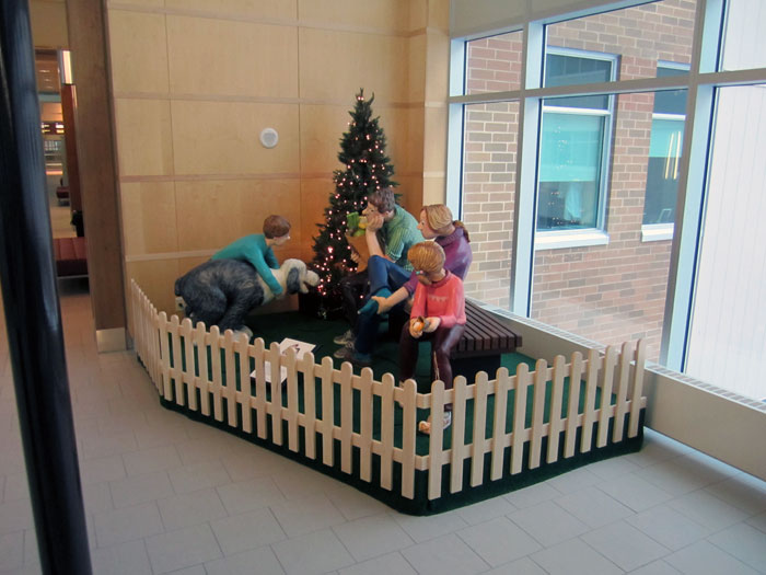
Shortly after our family moved from Lynn Lake, Manitoba to North Bay, Ontario, Stan Lawlor, the mayor at the time, thought it would be a great idea to create a sculpture for the downtown: something funny and fun that would highlight the fact that the comic strip, “For Better or for Worse” was now being produced there.
The strip was doing extremely well at the time, and in truth, a great deal of the imagery I used was taken from the community and surrounding countryside. I was thrilled. I did a series of drawings showing the characters in a family “situation” as seen from all sides. The design was approved.
A commission on art in public places was approached and funding was arranged, but as bronze would be extremely expensive, the committee decided on the kind of outdoor acrylic sculptures you see in theme parks and “McDonald’s”-style playgrounds. A wonderful group of sculptors with their studio in a Toronto warehouse were commissioned to do the work, and I had the pleasure of being there for much of the process. We all wanted the characters to be as recognizable in 3D as they were on the comics page, and this was a real challenge.
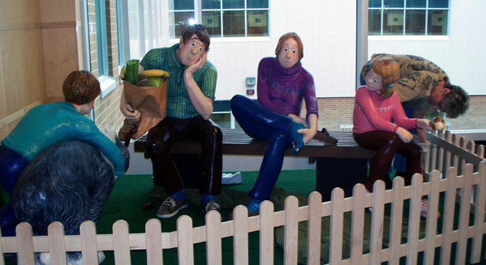
It took a number of months to complete the sculptures. The characters were arranged to look as though they had been on a long walk, had bought a few groceries, and were taking a break sitting on a bench in the middle of town.
Elly was massaging her feet, Elizabeth was eating an ice cream—unaware that much of it had fallen onto her shoe, Dad was holding a paper grocery bag, which had torn, and out of the bottom were hanging a couple of sausages. Michael was holding back an excited Farley dog who was trying to lunge for the sausages. It was funny, and fun to look at.
There was a strong metal armature inside each character. A wooden form was added, which was then wrapped in a mouldable acrylic foam used in the structure of bridges! This was then sculpted, painted with thick, durable outdoor paint, and covered with more layers of protective acrylic. The faces and fine details (hands, feet, the paper bag, and contents, etc.) were made of heavy fibreglass material and were extremely durable. The entire installation was strong, built for long-term outside wear and tear, and was securely bolted to a heavy wood and cement park bench.
There was a celebration when we uncovered the new community focus piece. I was so excited; so honoured to have my characters be part of the “City of North Bay!”
Photos were taken. Folks sat with the characters, and posed with them. We thought it would even be something tourists would enjoy. The Pattersons were going to have a permanent spot in the middle of town!
The installation lasted less than a week. Within 24 hours, vandals attacked and tried to destroy the sculpture. Even though the patrolling police were aware there might be some attempts to tamper with them, the violence with which these characters were attacked was fast and furious.
Vandals wanted to steal Elizabeth (she was the smallest of the characters), and with the force of rocking and sharp blows, the bolts securing her to the wooden part of the bench would have eventually given way. Michael Patterson and Farley the dog were kicked and hit with hard objects, and though not much structural damage was done, the resulting scratches and dents would take time to repair.
They also tried to destroy John Patterson. They hit him and scratched him with hard and sharp objects. They kicked and twisted and succeeded in breaking his glasses away from his face. Then they burned his eyes with cigarettes. This did the most damage of all. The burned eyes were shocking.
Interestingly, Elly, the mother, was untouched. The vandals left the mother alone entirely. There wasn’t a mark on her! I took this to mean that despite the troubles kids go through, perhaps the figure of “Mom” is still to be respected. Who knows!
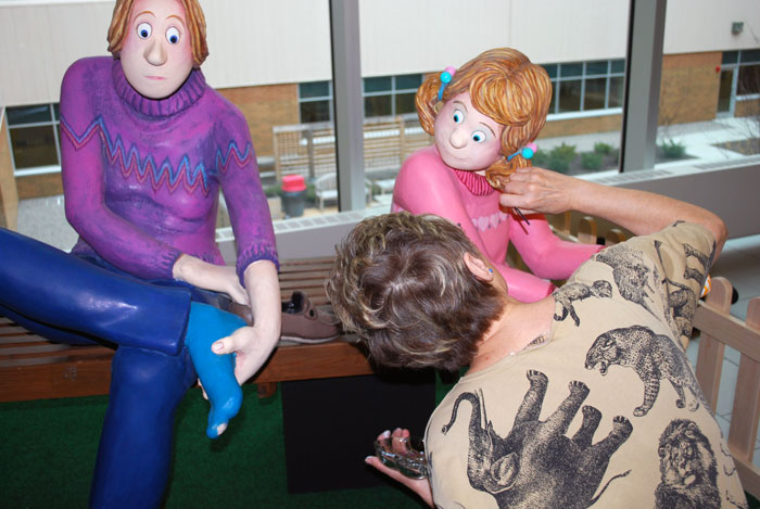
The attraction was quickly removed from the town square and kept for a while in the window of the local theatre. It was moved again a number of times and eventually put into storage. Years later, a new hospital was designed and built for the city, and the committee overseeing the acquisition of artwork to be installed in the lobbies and halls, suggested we bring it out, dust it off, and see if the old Patterson family sculptures might find a new home. They did find a wonderful new home! A bright corner of the main hallway of the new hospital was chosen as the permanent location for the long lost FBorFW sculpture.
The hospital was still under construction, so I was able to find an empty room (near the area where the figures would be placed) where I could work on repairing and repainting them. It was like bringing them to life again! This photo shows me making the final touch-ups to the Pattersons in their new, safe, public location where they are enjoyed by everyone who walks by. It’s a good ending to a sad story, and I’m once again grateful to the city of North Bay for making me, and my cartoon characters, so welcome for so long.
This is one of the earliest cartoons I did for McMaster U., and again, it was for “Epidemiology and Biostatistics.” Dr. Dave Sackett, head of this department, knew the value of comic art. His dad had been an editorial cartoonist, and with a series of lectures to present, most consisting of blue diazo slides full of graphs and columns of numbers, he knew that a laugh would wake up a comatose crowd.
This illustration was to illustrate the spread of disease through the consumption of unwashed fruit, and walking in bare feet on city streets. We were all much less concerned about sexual content then, so of course, I did the usual round bosom next to the round grapefruit and the hopeful expression on the face of the male consumer.
I always had fun lettering signs when I did this kind of sketch. This is something I learned from the late, great Len Norris: “Try to fill your cartoons with extras…it adds to the fun and is a sort of gift to the viewer.”